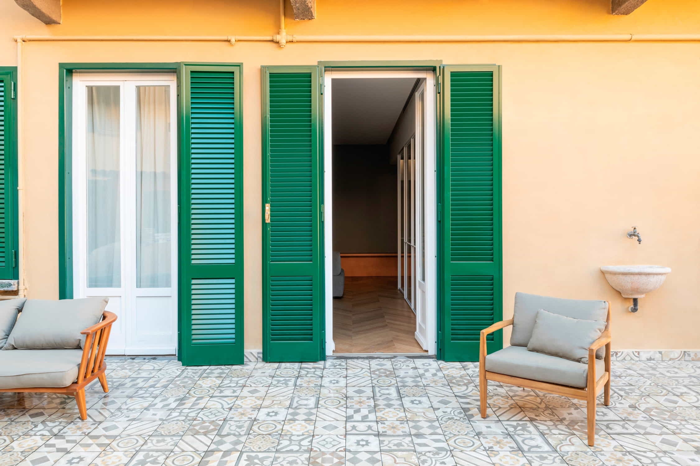
In the heart of Milan's Tortona fashion district is a 140 square metre apartment designed by Spread Out Studio and architect Marco Maiorana. The link with the district - and with it the fabrics, colours and attention to detail - was emphasised and sought throughout the design phase. The apartment, located in an old and historic Milanese building, has a precise and clear division of space into three macro-areas: the living area, the transit and service area, and the sleeping area with balconies.
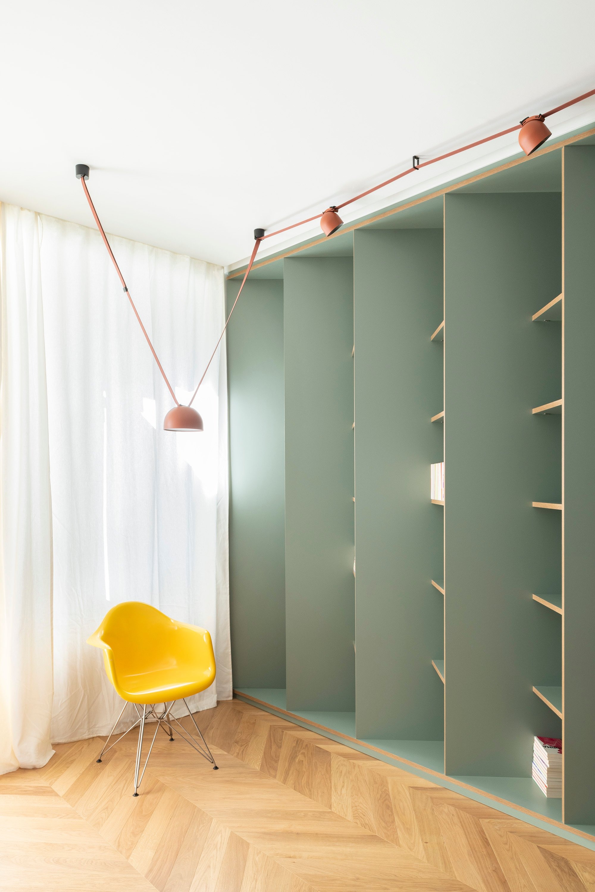
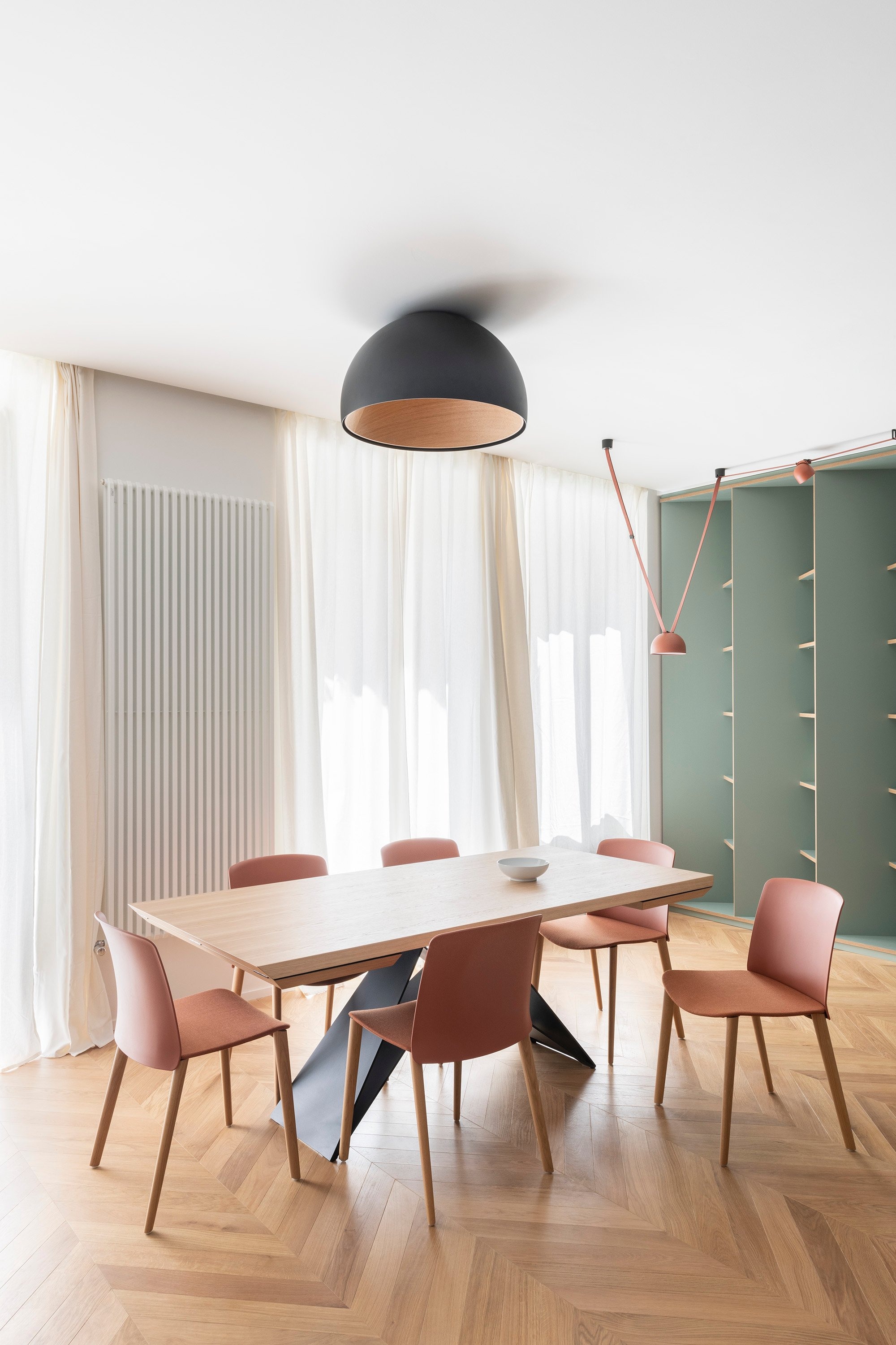
The choice of natural oak parquet with a French herringbone pattern sets the tone for the entire renovation. In fact, the wall system opposite the entrance was designed in collaboration with the designer Marco Albani, with a full-height open bookcase, painted in shades of sage, that 'turns' at 45 degrees to follow the parquet. This gesture is the result of a precise analysis of the customer, a collector and vinyl enthusiast who is a little disorganised. This creates an interplay in which the objects on the shelves are revealed as you move around the room, providing more privacy.
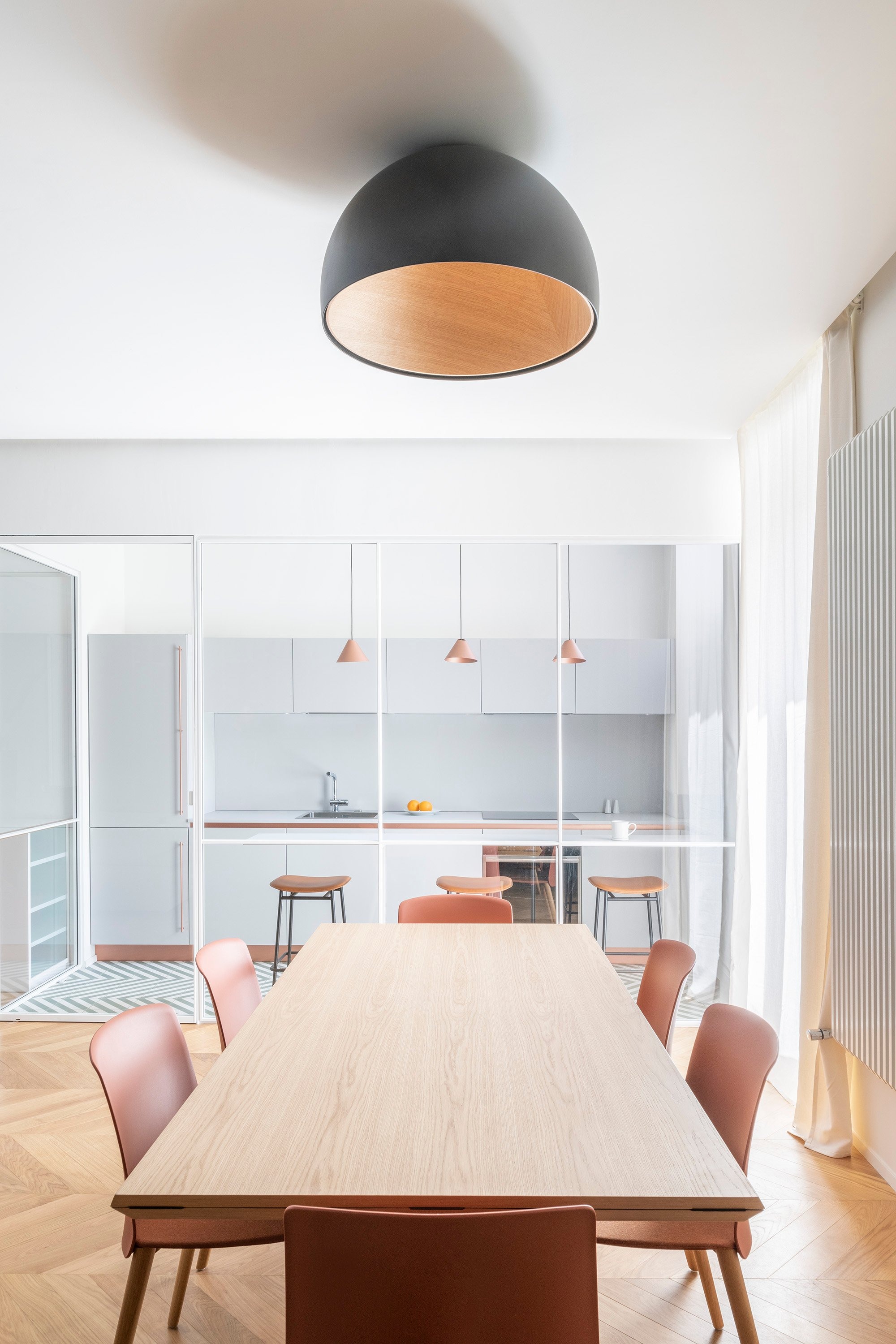
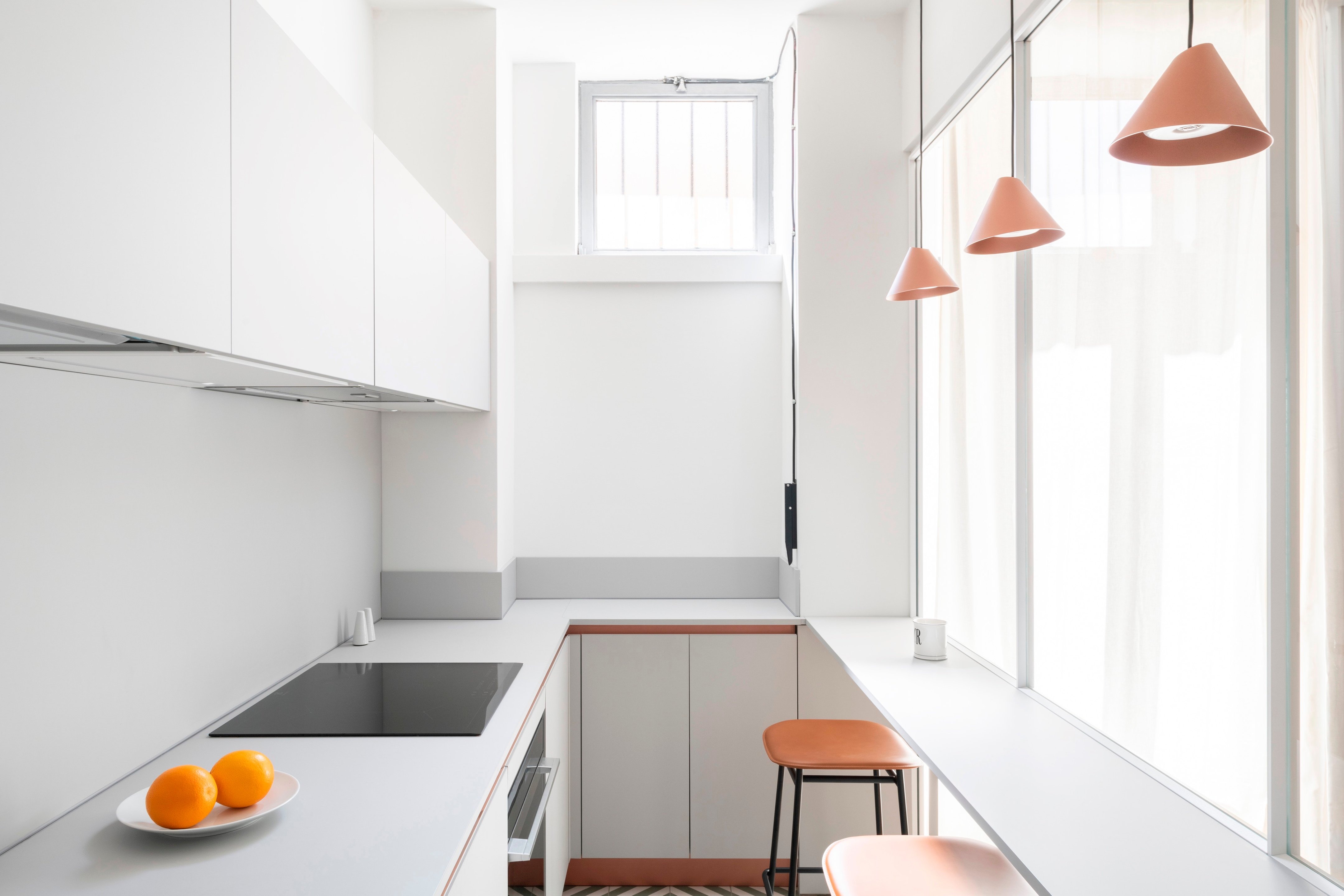
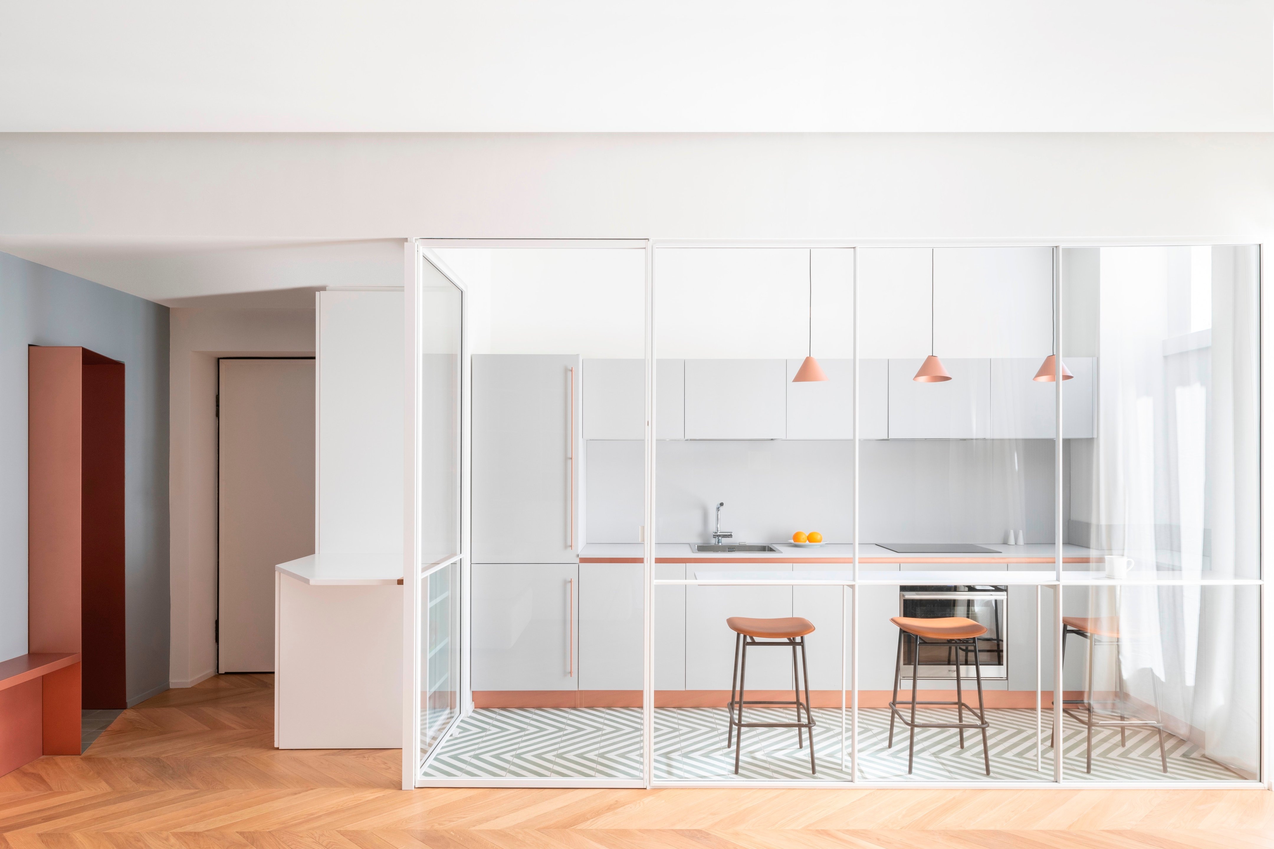
The kitchen has a stoneware floor in shades of white and sage that echoes the pattern of the parquet. A peninsula with leather stools and copper pendant lights echoes the warm tones of the brick. Copper is also used in the details of the kitchen. Everything else is in Fenix light grey, chosen to soften the strong charge of the metal and the other colours.
On the wall next to the bookcase, a copper shelf with a foot that reaches the floor follows the uprights at 45 degrees. This protrusion is reminiscent of the details in the kitchen and marks the free wall of the living room, painted in grey enamel. From here, the entrance to the sleeping area is defined by an asymmetrical sheet metal portal with large copper sides. The floor perfectly follows the cut of the portal and changes according to its function, becoming sage-green stoneware in the same tones as the library.
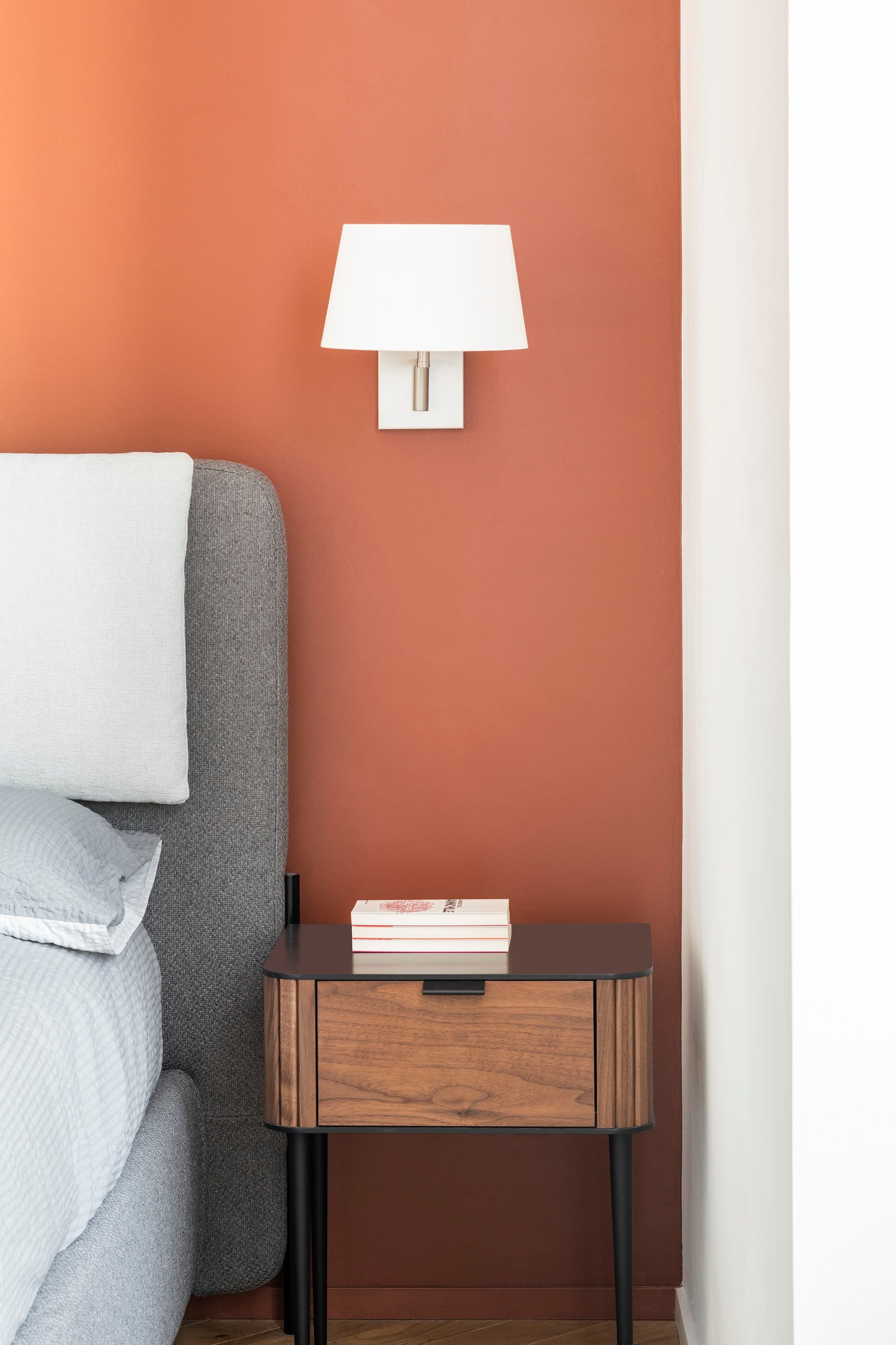
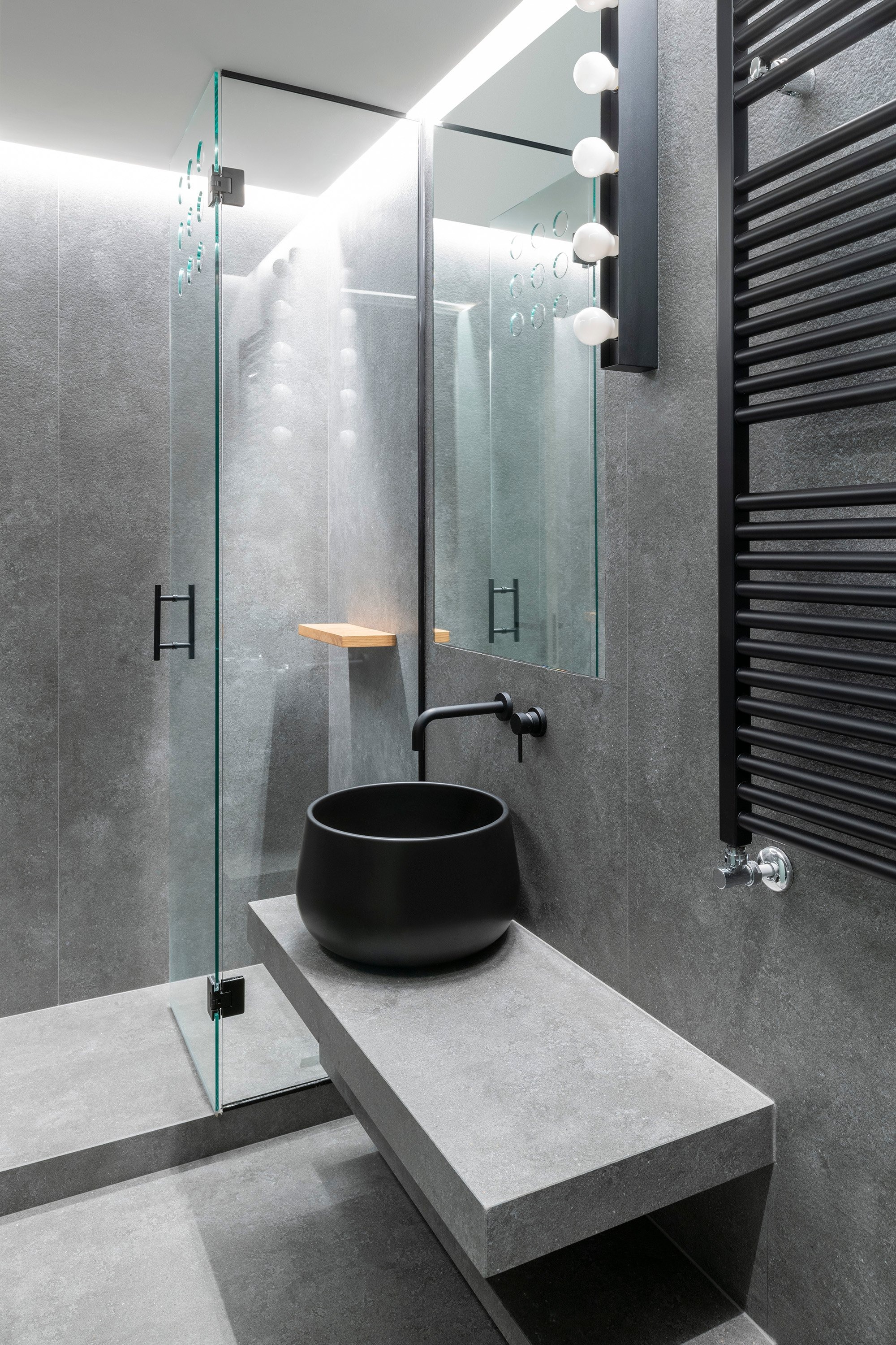
The bedrooms are minimalist: the master bedroom has an en-suite bathroom with a light stone surround and a walk-in wardrobe that disappears behind flush doors that are as white as the walls.

